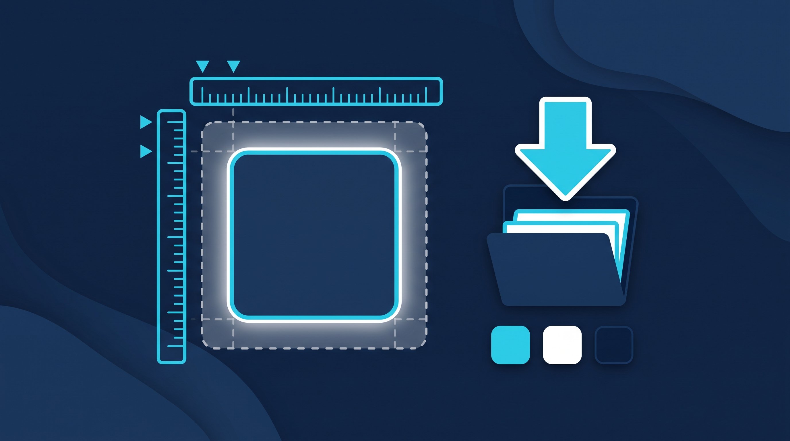
LinkedIn offers two logos: the square [in] logo and the full LinkedIn wordmark. You can download both for free as a ZIP file frombrand.linkedin.com/downloadsYou can use the [in] logo as a link to your profile, for example in your email signature, on your CV or on your business card. LinkedIn only permits use of the full LinkedIn logo with a trademark licence.
As of October 2026.On October 3, 2026, we put the brand guidelines onbrand.linkedin.comread. We deliberately show no logo files or recreations here. The images in this article are our own diagrams and do not contain any logos.
Download the LinkedIn logo: How to get the official files
LinkedIn states on its brand page: “Any logos or images found elsewhere on the web are not approved for use.” So logos from icon libraries, stock image sites or image searches are not approved, even if they look identical. There is only one official source:
- Open brand.linkedin.com/downloads.
- Choose the package: “Download [in] Logo” for the square icon or “Download LinkedIn Logo” for the full LinkedIn logo.
- By downloading, you agree to the “LinkedIn Brand and User Agreements,” including the brand guidelines, user agreement, and community guidelines.
- Extract the ZIP file and choose the colour variant that suits your background.
For most purposes, you only need the [in] logo. According to LinkedIn, you can only use the full LinkedIn logo if you already have a business relationship with LinkedIn and a brand or trademark license: “LinkedIn does not allow anyone to use the LinkedIn Logo, unless they already have an existing relationship with LinkedIn and a Brand or Trademark License.”
An overview of variants, formats and colours
The table only includes what LinkedIn shows on the pages.[in] Logo it and enter it LinkedIn Logoprovides themselves.
Logo | What it is | Format and size | Colours | Who can use it |
|---|---|---|---|---|
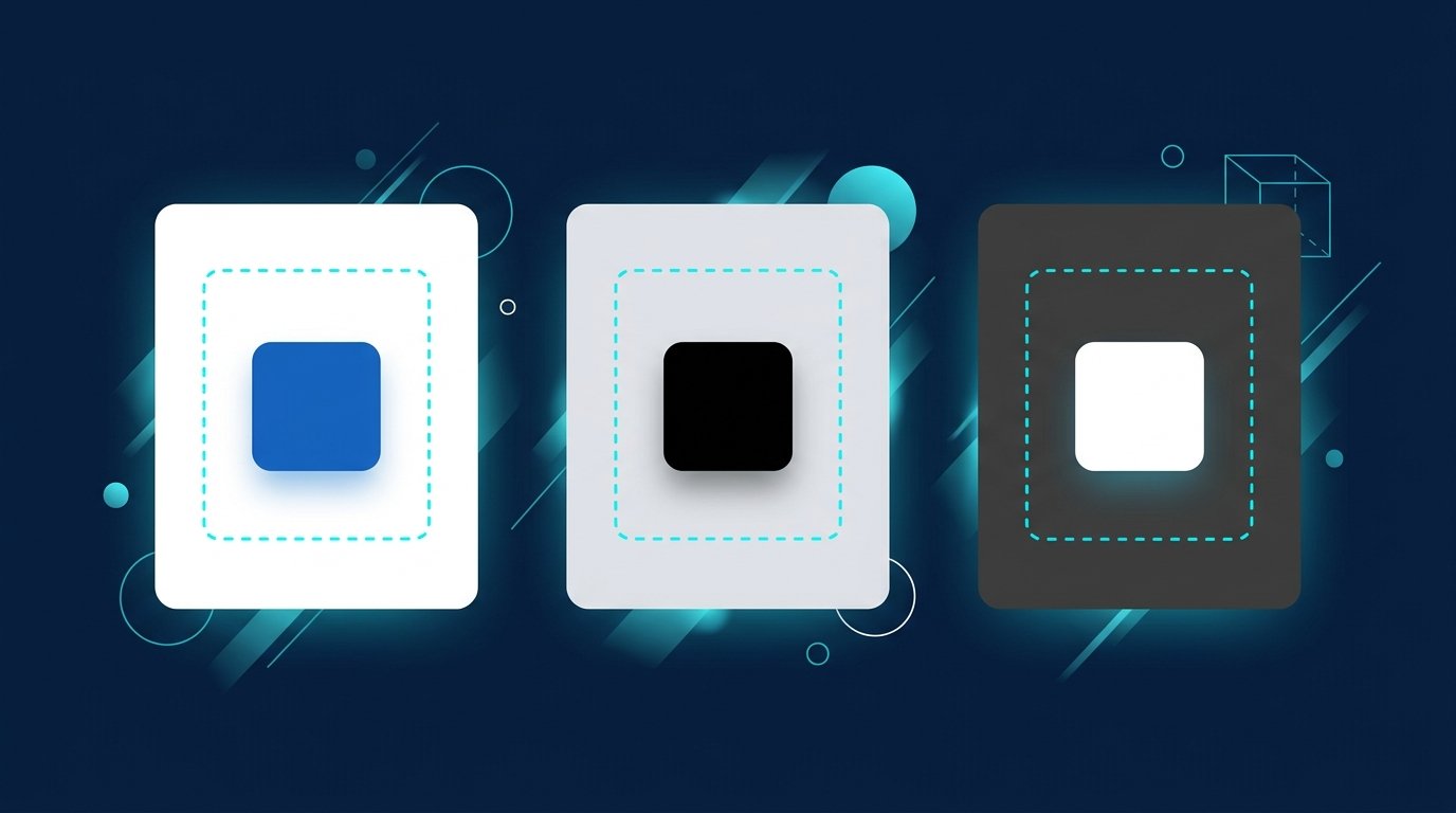
[in] logo | The square icon someone means when they search for “LinkedIn icon” | ZIP package on brand.linkedin.com; the high-resolution version is required for print. | Blue, black, white; preferably blue on a pure white background, otherwise on a light, solid-colour background with sufficient contrast. | all members in the cases listed below |
LinkedIn logo | the word “LinkedIn” with the [in] part | Transparent PNG in several sizes; other formats available on request. The [in] element must be at least 21 px on screen or 6.35 mm in print. Do not enlarge beyond its native size. | Online, always in colour, preferably blue on white; in print, single-colour white or black if necessary. | Only with an existing brand or trademark licence |
LinkedIn does not specify a hex colour code in its guidelines. Use the colour from the official file rather than trying to recreate it. The full LinkedIn logo also requires clear space: “The minimum clear space is defined as the height/width of one [in] Logo.” Leave at least that much space on all sides, based on the height or width of the [in] logo.
LinkedIn logo as PNG or SVG?
PNG is a raster format: the file is made up of pixels and becomes blurry when enlarged. SVG is a vector format: it describes shapes and stays sharp at any size. For a fixed-size icon on the web, a PNG at the right resolution is enough. For large formats and print, vector is the better choice.
For the full LinkedIn logo, LinkedIn specifies “transparent PNG format” and adds, “Other file formats may be provided upon request.” An SVG is therefore not available for direct download. If you need a vector format, contact LinkedIn. For the [in] logo, LinkedIn requires the high-resolution version for all print applications: “The high resolution [in] Logo must be used for all print applications.”
What you can use the [in] logo for
The brand page lists the permitted cases for members individually:
- as a link to your LinkedIn profile, your company page, or a group
- on your business card, always alongside your profile link or LinkedIn QR code
- In the email signature as a link to a profile, company page, or group
- next to your personal LinkedIn QR code
- in a row of social media icons showing where you’re active
- along with an invitation to view your LinkedIn profile
Developers with API access may also use the [in] logo as a “Share” button and as a widget for following a company page.
What the guidelines rule out
- Change the color or shape of the [in] logo. Other colors are available only upon request at trademarkrequest@linkedin.com, for example if a set of icons uses a uniform color.
- combine the logo with other symbols, logos, words, images, or design elements
- incorporate the logo into a word or slogan. LinkedIn’s own examples: no “[in]vesting” or “Love[in]”.
- use the logo in a way that makes it look like LinkedIn is a partner or endorses you
- imitate the look of the LinkedIn platform
- Register trademarks that include LinkedIn’s trademarks
In a row of social media icons, the background can be any colour, but the icon itself must use one of the three official colours.
The [in] logo in your email signature and CV
The most common permitted use is straightforward: the [in] icon as a link to your profile. In your email signature, it appears alongside your name, role and phone number; on your CV, it goes in the contact details. The link matters: an icon without a destination won’t take anyone to your profile.

Create your signature with our free email signature generator. See a live preview, add your LinkedIn QR code if you like, and do it all in your browser without signing up.Open tool
The article on how to find your personal code shows you how.LinkedIn QR code. In your CV, the icon belongs in the contact details, alongside your customised profile URL. How to align your CV and LinkedIn profile is explained byCreate a LinkedIn résumé.

From icon to conversation
An icon in an email signature, CV or job posting waits for someone to click it. You can take the first step yourself. CompLeadly is a desktop app that runs on your own computer. It turns a search into a target audience, visits their profiles, sends connection requests, and follows up with an initial message and further messages:
- Sales: A LinkedIn or Sales Navigator search for your ideal customers becomes a list that CompLeadly works through.
- Recruiting: With a Recruiter licence, CompLeadly works with Recruiter searches, pipelines and saved searches. How to set this up in Recruiter is explained in the recruiting use case.
- Applicants: A people search for team leads at your preferred employer becomes a list of people you can connect with directly.
After a 10-day trial with all features, you can keep using CompLeadly for free, with basic features and a daily limit, such as 2 connection requests per day.
The history of LinkedIn and its logo
The key dates in the company’s history are well documented; the logo’s history is not. These milestones appear in the German it and enter it English Wikipedia, accessed on 3 October 2026:
- December 2002: Reid Hoffman founds LinkedIn in Mountain View, California, together with Allen Blue, Konstantin Guericke, Eric Ly and Jean-Luc Vaillant.
- 5 May 2003: LinkedIn goes live.
- 19 May 2011: LinkedIn shares are traded on the New York Stock Exchange for the first time under the ticker symbol “LNKD”.
- 8 December 2016: Microsoft completes its acquisition for US$26.2 billion.

LinkedIn does not document exactly what earlier versions of its logo looked like or when they changed. We could not verify claims circulating online about the fonts and dates of individual versions using reliable sources, so we have left them out. In any case, the only authoritative versions are those currently available to download from brand.linkedin.com.
Read more
How to set up a company page with a logo is explained in Create a LinkedIn Company Page. What is behind the platform is summarised by What is LinkedIn? and how to get the verification badge LinkedIn verification.
Frequently asked questions: LinkedIn logo
Where can I download the LinkedIn logo?
At brand.linkedin.com/downloads. There are two ZIP packages: one for the [in] logo and one for the full LinkedIn logo. By downloading them, you agree to the brand guidelines. According to LinkedIn, logos from other sources are not approved.
Is the LinkedIn logo available as a PNG?
Yes. LinkedIn lists transparent PNG files in several sizes for the full logo. For print, the high-resolution version of the [in] logo is required. LinkedIn provides other formats on request.
Is the LinkedIn logo available as an SVG?
Not as a direct download. LinkedIn lists transparent PNG as the available format and says other formats can be provided on request. SVG files from icon collections are not approved, even if they look the same.
Can I use the LinkedIn logo on my website?
You can use the [in] logo as a link to your profile, company page or group, including in a row of social media icons. It must not imply that your site is affiliated with LinkedIn. Using the full logo requires a trademark licence.
Is the LinkedIn logo available in white and black?
Yes. The [in] logo is available in blue, black and white. Blue on a pure white background is preferred. In a row of social media icons, the background can be any colour, but the icon must remain one of those three colours. LinkedIn approves other colours only on request via trademarkrequest@linkedin.com.
What is the LinkedIn icon?
“LinkedIn icon” refers to the square [in] logo. It is the version for email signatures, business cards, CVs and rows of icons. You can create a matching signature block with the email signature generator.